Beyond Accessibility Compliance | Designing Truly Inclusive Exhibits
![]()
Summary
Inclusive exhibition design goes beyond accessibility compliance to create museum and gallery experiences that are welcoming, intuitive and engaging for all visitors. Through thoughtful choices around label design, viewing angles, wayfinding, lighting and alternative formats such as Braille, audio and tactile interpretation, exhibitions can better support a wide range of physical, sensory and cognitive needs. Rather than treating accessibility as a checklist exercise, truly inclusive design considers how visitors experience and navigate a space in practice, helping every individual feel confident, comfortable and able to fully connect with the exhibition narrative.
![]()
“All members of the community should feel like they are able to walk through the doors and be part of your museum.”
Patty Dees, Director of Education, Booth Wester Art MuseumRather than being a narrow compliance exercise, a truly inclusive exhibit is constructed through a series of design choices that respond to the full spectrum of human needs and perspectives in a gallery or museum setting.
The Equality Act 2010 set a legal framework in the UK for public services through duties on discrimination and reasonable adjustments. Built on these foundations, effective exhibition design provides interpretive choices informed by the lived experience of visitors.
Each detail, then – from the legibility of text and angles of display panels to the consistency of wayfinding and the availability of tactile or audio alternatives – has a direct impact on visitor confidence. Even the precise positioning of labels relative to cases, plinths, and objects determines how effectively they can participate.
The job of delivering inclusive interpretation consistently requires hardware that supports precise planning. Absolute’s Information & Signage range is designed for such a purpose, helping curation teams apply accessible design principles across every element of an exhibition.
How to make the first point of contact clear and legible
Accessible label design ensures that information is reachable, readable, and inclusive of every visitor’s needs, creating a clear and reliable bridge between the object and audience.
Smithsonian guidance states that essential exhibition label text should be accessible to people with difficulty reading English, and that label information should also be available in alternative formats, such as Braille or audio, for people who cannot read print.
RNIB guidance also points to large print, Braille, bright lighting and bold signage as practical tools for improving access for the blind and partially sighted – principles which place clarity, choice and ease of use at the centre of interpretation design.
Legibility, meanwhile, is shaped by several design decisions working in harmony. Type needs sufficient contrast against its background, and the WCAG 2.2 benchmark of at least 4.5:1 for normal text is a useful reference point when teams review label design choices.
Surface materials are also a key consideration. Gloss, reflections and poorly controlled lighting can unpick the work of good typography in seconds. Absolute’s Label Holder range is designed to present information discreetly with a clear or low-reflect acrylic cover, while the Pinnacle Freestanding Label Holder range and Reader Rail also use low-reflect acrylic to reduce visual interference.
![]()
The importance of label height and angle
A well-written, highly legible label still fails if visitors have to crane their necks upward, bend awkwardly, or shift position to read it.
It’s those physical dimensions: the viewing angle, the distance from the object, the route around the display, and the height of the panel that all have a direct effect on comprehension. And it’s here where product choice becomes a key part of the access strategy.
Absolute’s Information Stand presents text at an easy-to-read 60-degree angle and is designed with height and angle intended to be accessible to all. The Reader Rail uses the same 60-degree display angle, can run continuously around a display, and is designed to maximise accessibility while accommodating longer narratives.
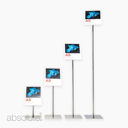
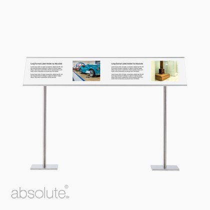
For labels that need to sit close to an object or case, the Pinnacle range offers 45-degree presentation, low-reflect covers, and a choice of heights and mounting types, including freestanding, wall-mounted, and long-format versions. That kind of flexibility allows exhibition teams to think carefully about seated reading positions, child height, display case constraints and the clean presentation that museum spaces demand.
![]()
Build layers of access into the content and the display
Inclusive exhibits communicate in layers.
Some visitors want a short orienting line and a clear object caption. Others want deeper context, extended interpretation, audio content, tactile access or multilingual text.
Smithsonian guidance states that exhibition content should be accessible at multiple intellectual levels and through more than one sensory channel, and that items central to the exhibition theme should be accessible through tactile examination and or comprehensive audio description.
In practical exhibition design, this often means separating information into levels. A concise caption may sit immediately beside the object, while longer interpretative text is positioned nearby in a format that is easier to approach.
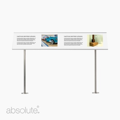
Absolute’s Pinnacle Label Holder Long Format is designed for extended text and multilingual interpretation, making it a smart fit for displays that require greater explanatory depth. Reader Rails serves a similar function on a larger scale, giving curators room for narrative, images and contextual information in a continuous, accessible format. Used with consideration, museum-grade information and signage systems accommodate the needs of visitors who want extra detail without forcing dense text into the smallest possible space.
The importance of wayfinding in accessible museum design
In a museum or gallery, visitors need to understand where a display starts, how its story unfolds and where to go next.
Smithsonian guidance recommends offering a clear path through the exhibition, with introductory labels, repeated themes or other devices that help people follow a complex presentation. RNIB guidance similarly points to large, bold signage, good lighting and Braille as practical ways to make environments easier to navigate for blind and partially sighted people. Clear wayfinding reduces hesitation, mental load and unnecessary congestion, particularly in busy galleries or unfamiliar spaces.
Absolute’s signage range offers teams several ways to bring the required clarity to a space. Fixed Label Holders can work for wall-mounted captions and small directional information. Information Stands provide portable interpretation and instructions at an easy-to-read angle. Reader Rails can define the edge of a display while carrying the narrative forward, and barrier-mounted signage can reinforce routes and visitor guidance without visual clutter. The goal is a coherent information system, where labels, directions and narrative panels feel connected in tone, placement and reading experience.
![]()
Review your interpretation against an inclusive labeling checklist
The most useful accessibility checklist is the one that asks how the interpretation performs in the room.
Can a wheelchair user approach and read it comfortably? Can a child understand the hierarchy of information? Is the text legible under gallery lighting? Does the display offer an alternative to print where needed? Do longer texts have enough physical space to breathe? Is wayfinding consistent enough that a first-time visitor can navigate without uncertainty?
Such questions yield better outcomes than a binary pass-or-fail exercise because they reflect the true experience of the exhibit.
If you are reviewing interpretation for a new exhibition or an existing gallery refresh, Absolute's Information & Signage collection gives you a practical set of tools to support your project, from discreet Label Holders and the super flexible Pinnacle range to accessible Information Stands and Reader Rail systems for richer narrative displays.
Talk with Absolute Products about your gallery and exhibition needs.

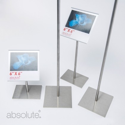 Pinnacle Label Holder Freestandingfrom $132.30 (ex VAT)
-
Posted by Jack Turner
14th May 2026
FREE Delivery to the US for all orders over $1500
View Our Museum & Gallery Products Digital Brochure